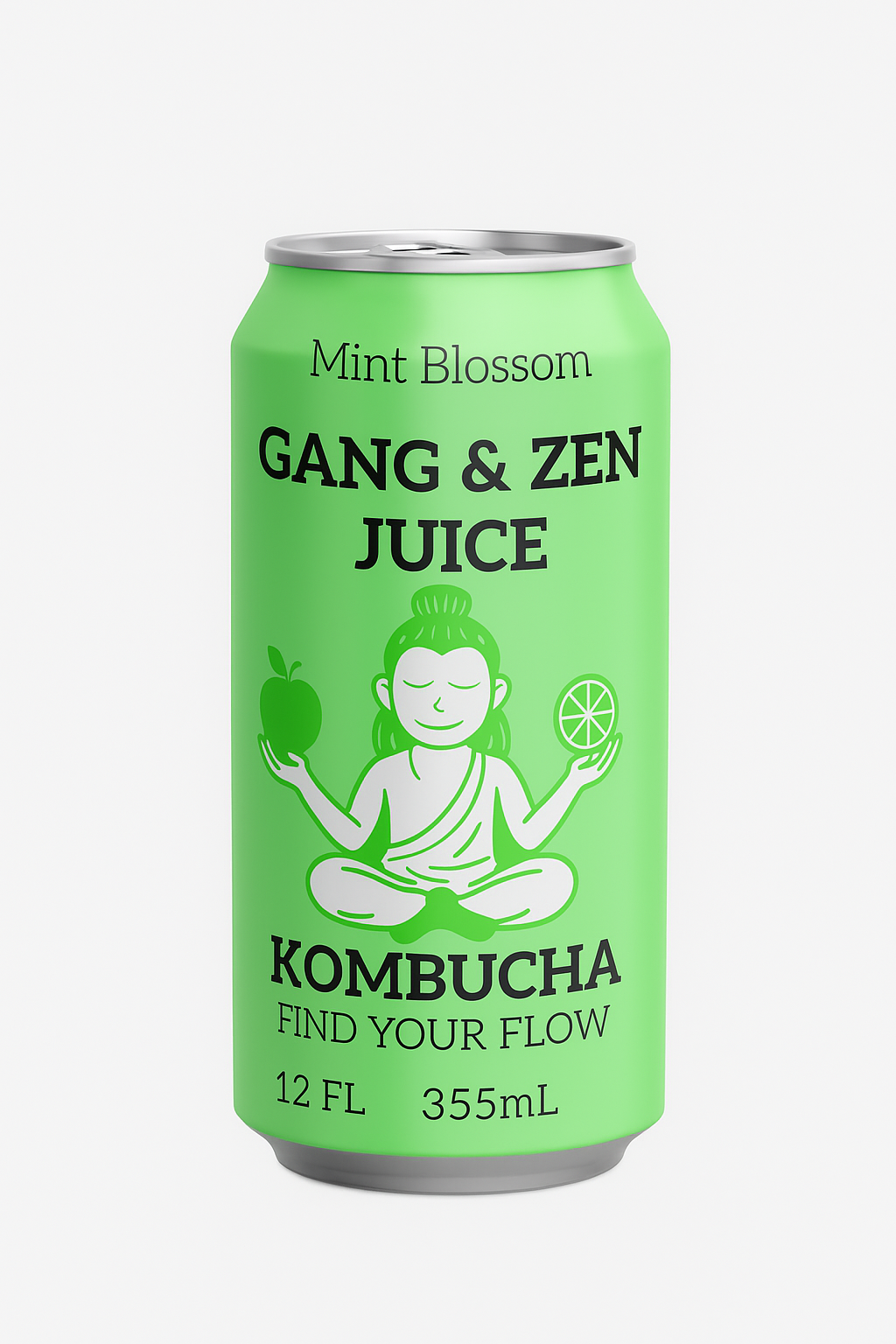
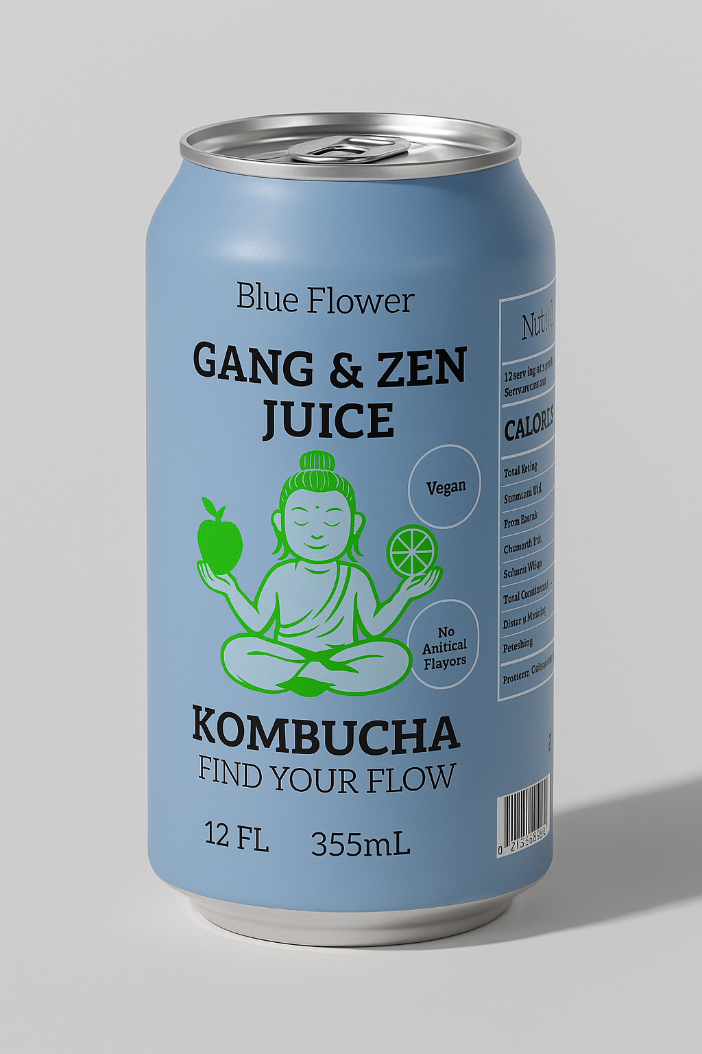

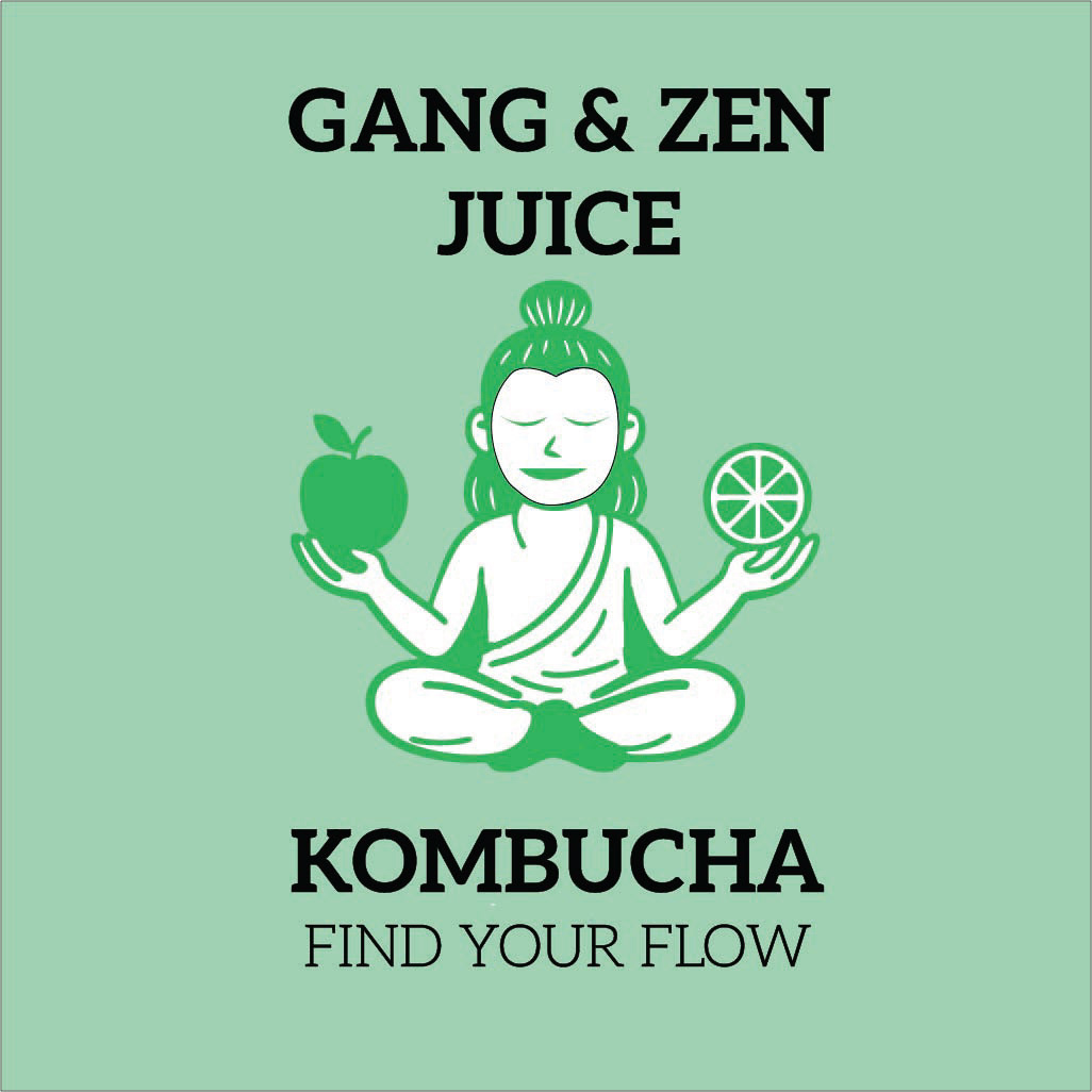
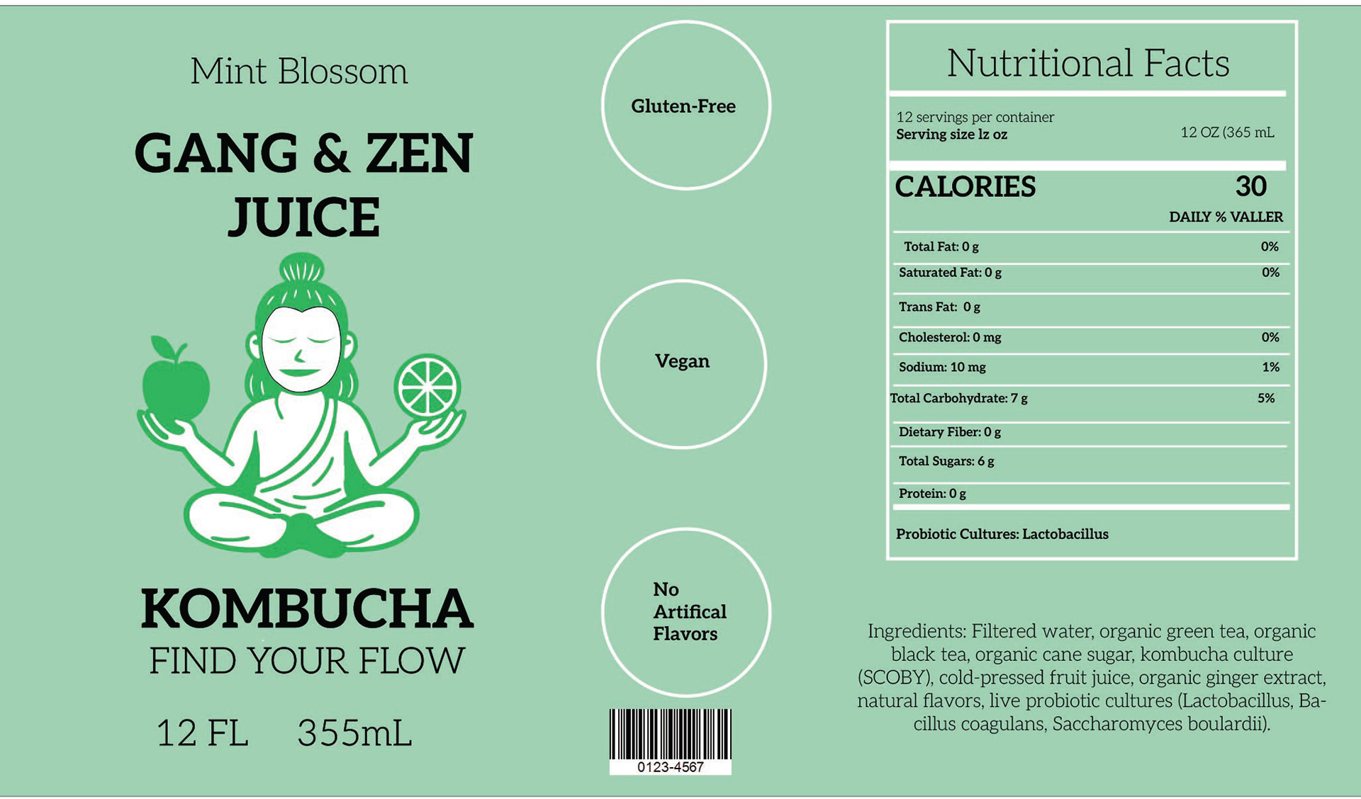
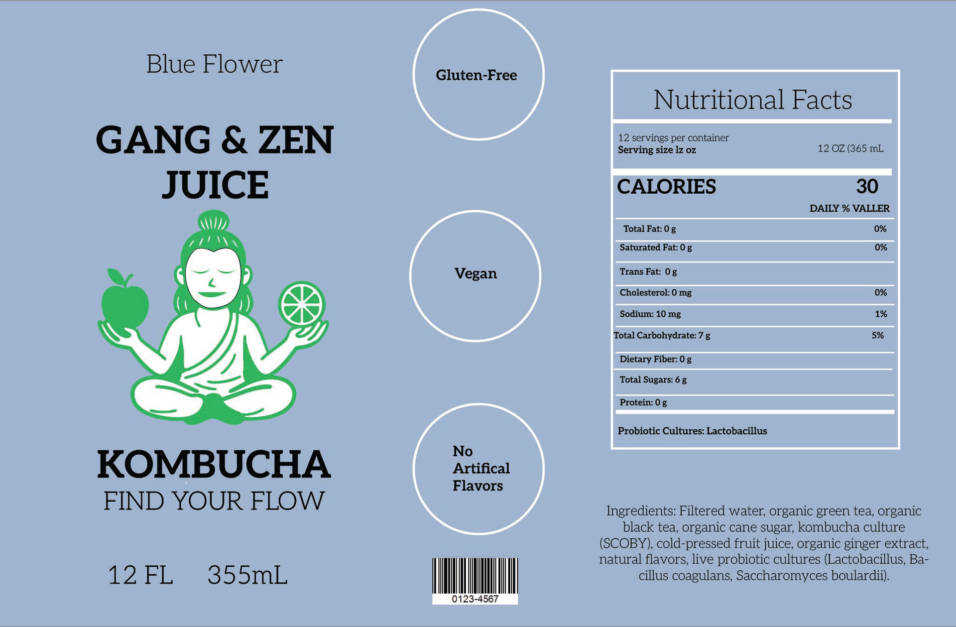


The Gang & Zen Juice can design was inspired by the balance between wellness and bold self-expression. The goal was to create a label that feels refreshing, modern, and rooted in a calm, mindful lifestyle while still standing out on the shelf. Soft, vibrant colors like mint green and cool blue were chosen to represent natural flavor profiles, freshness, and clean ingredients. The illustrated Zen character centered on the can communicates balance, flow, and a holistic approach to health. The simple line art paired with bold typography helps the product feel both approachable and premium. The layout is intentionally clear and easy to read, featuring straightforward flavor names, vegan icons, and essential product details. This makes the design user friendly while strengthening brand identity. Overall, the design blends calm color palettes, minimalist illustration, and clean structure to create a kombucha brand that feels fresh, mindful, and aligned with a modern wellness lifestyle.