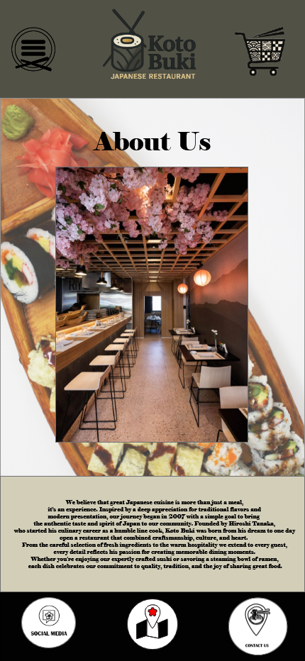
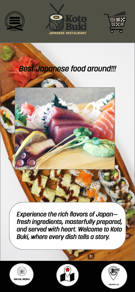
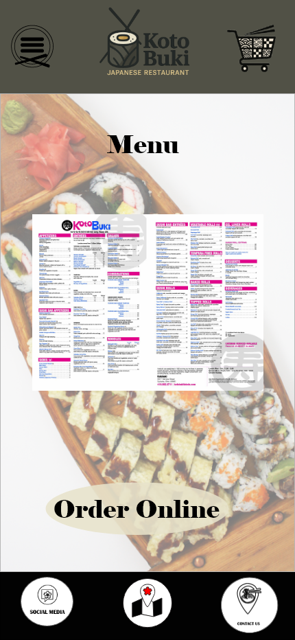


The Koto Buki mobile design focuses on clean, modern elements inspired by Japanese aesthetics and traditional dining culture. The layout uses a balanced combination of minimal typography, soft color palettes, and simple geometric shapes to create an elegant, calming user experience. Visual spacing, clean icons, and organized menu sections make navigation straightforward and user friendly. Subtle cultural cues—such as red accents, natural textures, or Japanese-inspired illustration styles—help reinforce the restaurant’s identity without overwhelming the interface. High-quality imagery, rounded buttons, and neatly structured content blocks support a smooth browsing experience and guide users toward key actions like exploring the menu, placing an order, or making a reservation.